|
Movements
We Feel Fine is divided into six discrete movements, each illuminating a different aspect of the chosen population. These movements are represented in the We Feel Fine applet.
To navigate between movements in the applet, the viewer should scroll over the heart at the bottom left corner of the applet and click on the desired movement.
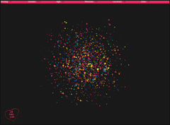 Madness, the first movement, opens with a wildly swarming mass of around 1,500 particles, emanating from the center of the screen and then careening outwards, bouncing off walls and reacting to the behavior of the mouse. Each particle represents a single feeling, posted by a single individual. The color of each particle corresponds to the tone of the feeling inside – happy positive feelings are bright yellow, sad negative feelings are dark blue, angry feelings are bright red, calm feelings are pale green, and so on. The size of each particle represents the length of the sentence contained within. Circular particles are sentences. Rectangular particles contain pictures. Madness, the first movement, opens with a wildly swarming mass of around 1,500 particles, emanating from the center of the screen and then careening outwards, bouncing off walls and reacting to the behavior of the mouse. Each particle represents a single feeling, posted by a single individual. The color of each particle corresponds to the tone of the feeling inside – happy positive feelings are bright yellow, sad negative feelings are dark blue, angry feelings are bright red, calm feelings are pale green, and so on. The size of each particle represents the length of the sentence contained within. Circular particles are sentences. Rectangular particles contain pictures.
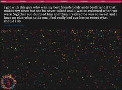 Any particle can be clicked at any time, revealing the sentence and/or photograph inside, along with any information about the sentence's author. As the particles careen around the screen, they lose speed and eventually freeze as they approach the mouse cursor, allowing them to be captured and clicked. As the particles approach the We Feel Fine heart in the bottom left corner of the screen, they become attracted to the heart and swarm around it, drawing the eye. As the mouse passes over the heart, a menu appears, revealing access to the other five movements of We Feel Fine. Any particle can be clicked at any time, revealing the sentence and/or photograph inside, along with any information about the sentence's author. As the particles careen around the screen, they lose speed and eventually freeze as they approach the mouse cursor, allowing them to be captured and clicked. As the particles approach the We Feel Fine heart in the bottom left corner of the screen, they become attracted to the heart and swarm around it, drawing the eye. As the mouse passes over the heart, a menu appears, revealing access to the other five movements of We Feel Fine.
The Madness movement, with its network of many tiny colorful particles,
was designed to echo the human world. Seen from afar, Madness presents
a massive number of individual particles, each colored and sized
uniquely, each flying wildly around the screen, proclaiming its
own individuality. At this level, Madness presents a bird's eye
view of humanity – like standing atop a skyscraper and peering down
at the street. People bustle to and fro, darting in and out of shops,
hailing taxis, falling in love, laughing, handling personal crises.
From the skyscraper, the people below are like ants – their words
cannot be heard, their facial features cannot be seen, and the notion
of individuality is hard to recognize. At this level, each particle
seems insignificant. Were one particle to disappear, one would hardly
notice. However, once a particle is clicked, it explodes into its
constituent letters, which then form its sentence, and that particle
becomes the center of attention. At this moment, the viewer sees
the open sentence as the only one that matters. Like people first
seen from afar and then encountered in person, the open particles
attain an individuality and depth of character that is striking when
compared to their relative insignificance in the skyscraper view.
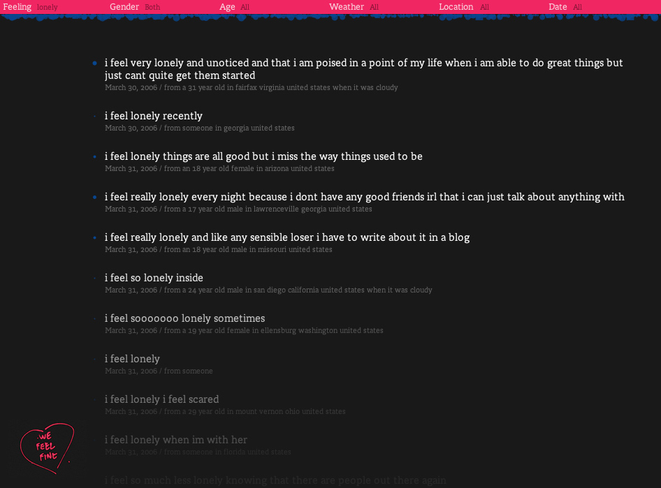
 Murmurs, the second movement, presents a highly structured environment in which to view human feelings. As this movement begins, every particle on screen gently floats upwards, eventually bouncing off the ceiling several times before settling. Then, one by one, the particles are excused from their attraction to the ceiling in order to join a simple scrolling list of human feelings, organized in reverse chronological order. The sentences appear letter by letter, as if being typed by their author, and fade to black as new sentences appear. At any one time, around ten sentences can be seen on screen. The strict formal constraints of Murmurs help to emphasize the gaping polarities in the types of feelings present in the world. Some are incredibly mundane, some are hilarious, some are poignant, others are quite shocking. As they march along, the feelings begin to strike a common chord. We are reminded that no matter what we feel, there are likely a number of other people around the world who feel the same. Murmurs, the second movement, presents a highly structured environment in which to view human feelings. As this movement begins, every particle on screen gently floats upwards, eventually bouncing off the ceiling several times before settling. Then, one by one, the particles are excused from their attraction to the ceiling in order to join a simple scrolling list of human feelings, organized in reverse chronological order. The sentences appear letter by letter, as if being typed by their author, and fade to black as new sentences appear. At any one time, around ten sentences can be seen on screen. The strict formal constraints of Murmurs help to emphasize the gaping polarities in the types of feelings present in the world. Some are incredibly mundane, some are hilarious, some are poignant, others are quite shocking. As they march along, the feelings begin to strike a common chord. We are reminded that no matter what we feel, there are likely a number of other people around the world who feel the same.
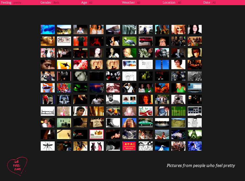
 Montage, the third movement, was created to answer questions like: what does sadness look like? Happiness? Loneliness? Montage, the third movement, was created to answer questions like: what does sadness look like? Happiness? Loneliness?
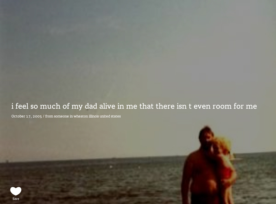
Montage presents the feelings from a given population that contain photographs, and displays these photographs in a simple grid of variable size, depending on the number of photographs available. Any photograph in the grid can be clicked, causing it to zoom in to the size of the screen.

When zoomed, a photograph's associated sentence is revealed, along with any information about the sentence's author. When zoomed, a small white heart appears in the bottom left corner, and clicking this heart allows viewers to save montage compositions they particularly admire. Saved montages produce 800x570 pixel JPEG images, which can then be downloaded, emailed to friends, or printed as postcards.
 There exists a gallery of montages that viewers have saved, allowing anonymous viewers of We Feel Fine to collaboratively curate an exhibit of especially beautiful, surprising, or otherwise interesting images..
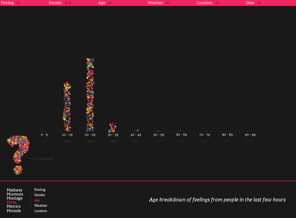
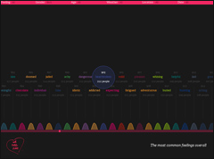
Mobs, the fourth movement, consists of five smaller movements, each of which utilizes a self-organizing particle system to configure its shape, color, distribution and physics to best express the different zeitgeists of: feeling, gender, age, weather, and geographical location.
 Mobs (Feeling) displays the most common feelings in the sample population. In this movement, the particles self-organize into rows of shared feelings. The rows are sorted by the number of particles they contain, and the particles within each row are sorted by the length of the sentence that each particle contains. The rows are colored to inherit the chosen color of the feeling they represent. Any particle can be clicked to reveal the sentence within.
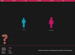 Mobs (Gender) displays the gender breakdown of the sample population. The male particles turn blue and form a giant male symbol. The female particles turn pink and form a giant female symbol. The particles with unknown gender retain their assigned feeling color and form a giant question mark. Mobs (Gender) displays the gender breakdown of the sample population. The male particles turn blue and form a giant male symbol. The female particles turn pink and form a giant female symbol. The particles with unknown gender retain their assigned feeling color and form a giant question mark.
 Mobs (Age) displays the age breakdown, in ten year increments, of the sample population. The particles form a standard bar chart, showing the number of feelings from each age range. The particles with unknown age form a giant question mark.
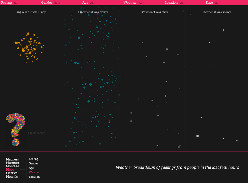 Mobs (Weather) displays the weather breakdown of the sample population. All weather conditions are pared down to four weather types: sunny, cloudy, rainy, and snowy. The screen divides into four columns, each representing a single weather type. The particles move to the appropriate column, and assume the color and motion behavior that best expresses their weather. Sunny particles turn yellow, and swirl around quickly in a thick circle, reminiscent of the sun. Cloudy particles turn light blue, and float along gently, as if on a breezy day. Rainy particles turn gray and fall down fast as if in a thunder storm. Snowy particles turn white and tumble around as if in a snow flurry. Any particle can be clicked to reveal the sentence inside. The particles with unknown weather form a giant question mark. Mobs (Weather) displays the weather breakdown of the sample population. All weather conditions are pared down to four weather types: sunny, cloudy, rainy, and snowy. The screen divides into four columns, each representing a single weather type. The particles move to the appropriate column, and assume the color and motion behavior that best expresses their weather. Sunny particles turn yellow, and swirl around quickly in a thick circle, reminiscent of the sun. Cloudy particles turn light blue, and float along gently, as if on a breezy day. Rainy particles turn gray and fall down fast as if in a thunder storm. Snowy particles turn white and tumble around as if in a snow flurry. Any particle can be clicked to reveal the sentence inside. The particles with unknown weather form a giant question mark.
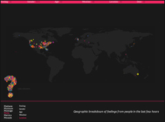 Mobs (Location) displays the geographical breakdown of the sample population. A world map appears, colored dark gray. The particles then move to the point on the map that corresponds to the geographical location of their author. The particles with unknown location form a giant question mark. Mobs (Location) displays the geographical breakdown of the sample population. A world map appears, colored dark gray. The particles then move to the point on the map that corresponds to the geographical location of their author. The particles with unknown location form a giant question mark.
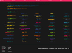
Metrics, the fifth movement, consists of five smaller movements. Whereas Mobs expresses the notion of “Most Common”, Metrics expresses the notion of “Most Salient”. A full discussion of the difference between “Most Common” and “Most Salient” is here. Essentially, the traits listed in Metrics are those that best distinguish the sample population from the global average (i.e. how is this population different?). Metrics displays the most representative traits of the sample population, along five axes: feeling, gender, age, weather, and location.
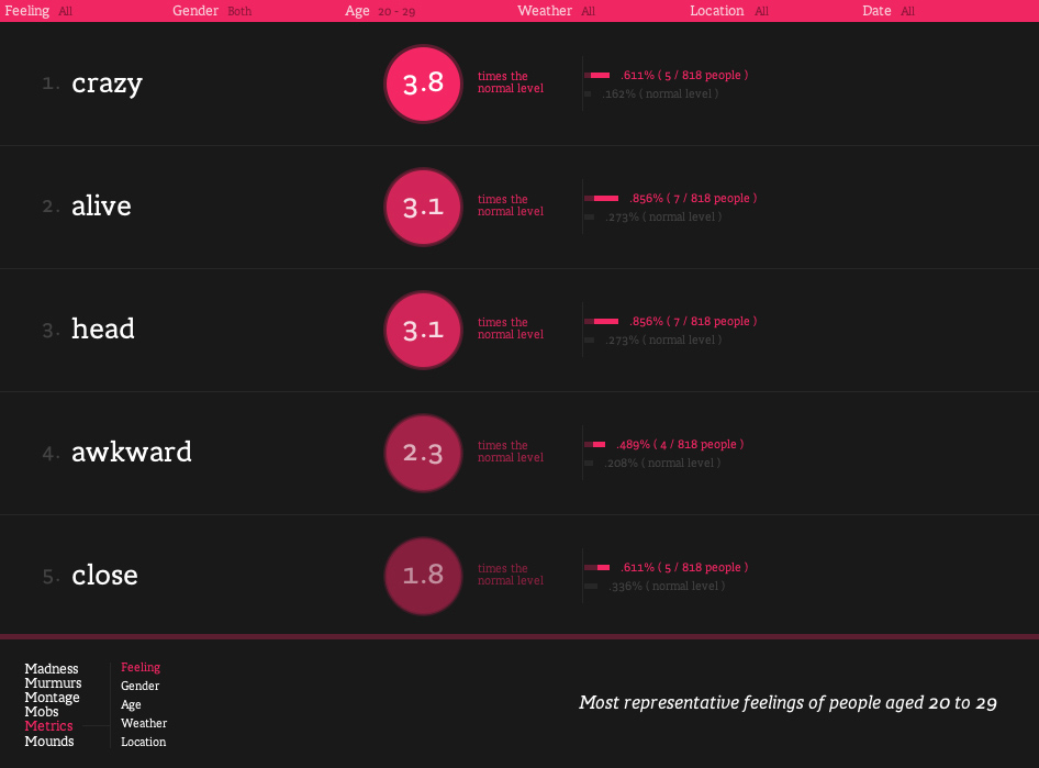
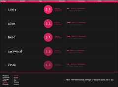 Metrics (Feeling) displays the most representative feelings of the sample population, along with some statistical data indicating the significance of the findings. The feelings themselves are listed along the left edge of the screen, ranked by the number of times their frequency in the sample population exceeds the global average. A large red circle holds this number. On the right side of the screen are a series of bar charts showing the number of times each feeling occurred in the sample population, and the number of times each feeling typically occurs. Metrics (Feeling) displays the most representative feelings of the sample population, along with some statistical data indicating the significance of the findings. The feelings themselves are listed along the left edge of the screen, ranked by the number of times their frequency in the sample population exceeds the global average. A large red circle holds this number. On the right side of the screen are a series of bar charts showing the number of times each feeling occurred in the sample population, and the number of times each feeling typically occurs.
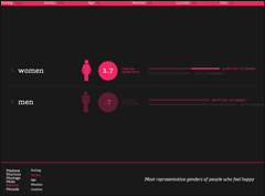 Metrics (Gender) displays a comparison between men and women for the sample population, indicating whether either gender is particularly salient (i.e. do women feel happy more than men?). The labeling and graphing follow the same conventions of Metrics (Feeling). Metrics (Gender) displays a comparison between men and women for the sample population, indicating whether either gender is particularly salient (i.e. do women feel happy more than men?). The labeling and graphing follow the same conventions of Metrics (Feeling).
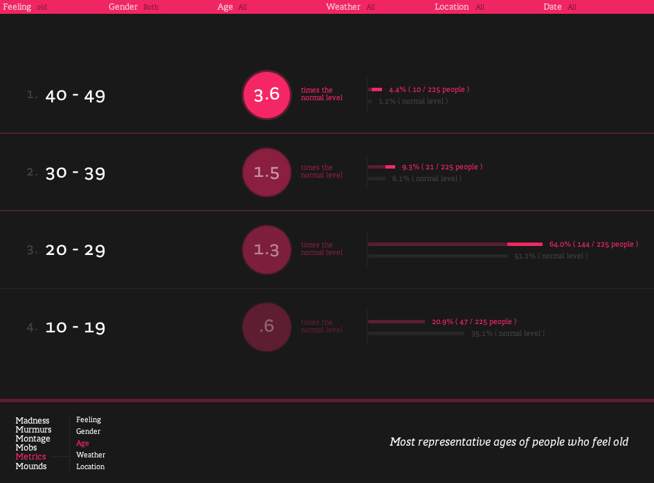
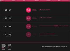 Metrics (Age) displays the most representative ages (in ten year increments) of the sample population, indicating whether a given age range is particularly salient (i.e. do 40 year olds feel old more than most people?). The labeling and graphing follow the same conventions of Metrics (Feeling). Metrics (Age) displays the most representative ages (in ten year increments) of the sample population, indicating whether a given age range is particularly salient (i.e. do 40 year olds feel old more than most people?). The labeling and graphing follow the same conventions of Metrics (Feeling).
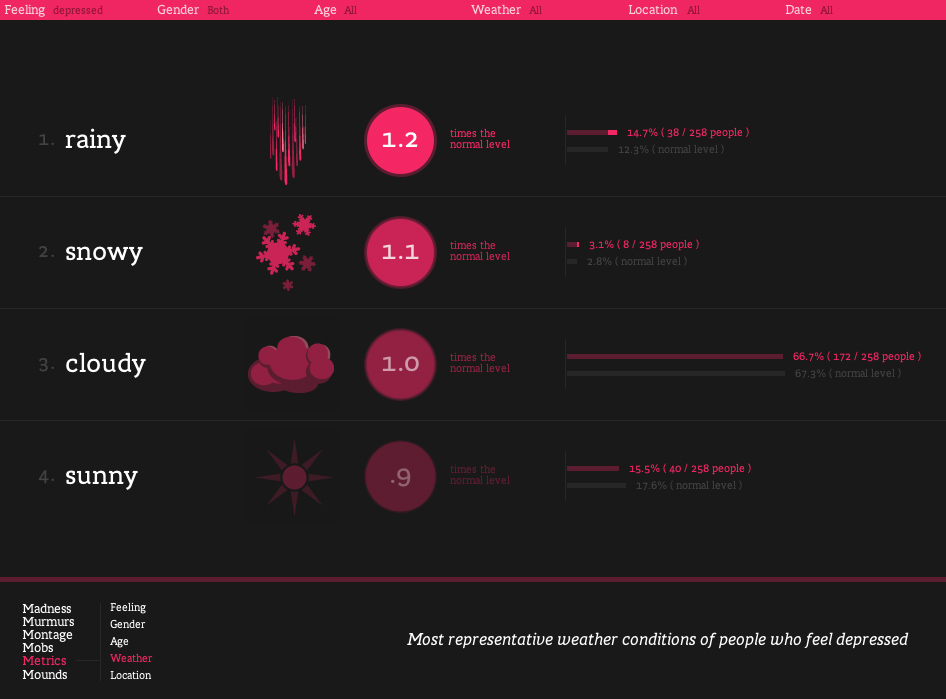
 Metrics (Weather) displays a comparison between the four weather types (sunny, cloudy, rainy, snowy) for the sample population, indicating whether a given weather type is particularly salient (i.e. do people feel depressed more often when it's rainy?). The labeling and graphing follow the same conventions of Metrics (Feeling). Metrics (Weather) displays a comparison between the four weather types (sunny, cloudy, rainy, snowy) for the sample population, indicating whether a given weather type is particularly salient (i.e. do people feel depressed more often when it's rainy?). The labeling and graphing follow the same conventions of Metrics (Feeling).
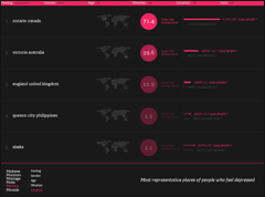 Metrics (location) displays the most representative locations (countries, states, and cities) of the sample population, indicating whether a given location is particularly salient (i.e. do Canadians feel cold more than most people?). The labeling and graphing follow the same conventions of Metrics (Feeling). Metrics (location) displays the most representative locations (countries, states, and cities) of the sample population, indicating whether a given location is particularly salient (i.e. do Canadians feel cold more than most people?). The labeling and graphing follow the same conventions of Metrics (Feeling).
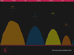
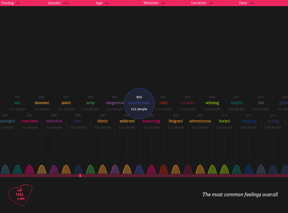
Mounds, the sixth and final movement, is independent of the sample population, always displaying every feeling in our database, scaled and sorted in order of frequency. Each feeling is portrayed as a large bulbous mound, colored to correspond to the feeling it represents. The mounds jiggle slightly when undisturbed, and bend away as the mouse cursor approaches their perimeter. Clicking the screen caused the mounds to jiggle wildly.
 A small scrollbar below the mounds represents the entire database of feelings, and allows the viewer to jump to a specific point in the list. The viewer can also position the mouse near the left or right edge of the screen to cause the mounds list to self-scroll. Above each mound is listed its feeling, along with the rank of that feeling, and the total number of occurrences of that feeling contained in our database. Clicking the feeling above a mound retrieves feelings from people who feel that way.
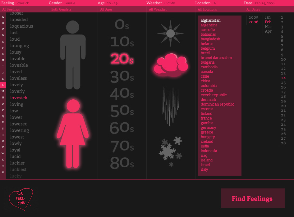
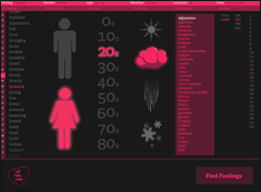 The Panel allows the viewer to control the sample population on screen at any one time. At all times, the red bar atop the screen presents a concise summary of the current sample population. Clicking that red bar causes the panel to open, and within the panel, viewers can constrain the population along any combination of the following axes: The Panel allows the viewer to control the sample population on screen at any one time. At all times, the red bar atop the screen presents a concise summary of the current sample population. Clicking that red bar causes the panel to open, and within the panel, viewers can constrain the population along any combination of the following axes:
- Feeling (happy, sad, depressed, etc.)
- Age (in ten year increments - 20s, 30s, etc.)
- Gender (male or female)
- Weather (sunny, cloudy, rainy, or snowy)
- Location (country, state, and/or city)
- Date (year, month, and/or day)
When satisfied, the viewer can press “Find Feelings” and We Feel Fine will retrieve any matching feelings from our database. Because of web browser limitations (the applet is highly CPU intensive), we limit the maximum number of feelings returned at any one time to 1,500 (on PCs) and 1,000 (on Macs). This means that searching for a very specific population (e.g. males from Afghanistan in their 20s when it is cloudy), will yield few or no feelings, and the feelings that are returned will likely stretch back several weeks or months in time. On the other hand, searching for a more general population (e.g. people who feel sad), will likely return the maximum number of 1,000 or 1,500 feelings, and those feelings will likely stretch back only hours or days.
|